Written by Angela Coloretti McGough
Recently, the Hau’oli Pastry logo underwent a transformation.
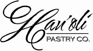
The previous logo focused on the word hau’oli (meaning happy in ‘olelo) with two different script fonts. The “H” was prominent, and the word “company” was included as an abbreviation. Calling this venture a company is a misnomer, though.
Hau’oli Pastry is an idea, born from the enthusiastic passion of one man, my husband, Chef John McGough. He didn’t start out as a pastry chef, but over many years working in the food and beverage industry, he realized he really wanted to learn how to make desserts. He once told me that as a GM, he would go into the kitchen to decorate dessert plates with chocolate for customers celebrating birthdays or anniversaries.
John completed his culinary training and finished Top Toque with his certificate in pastry and baking from Le Cordon Bleu Las Vegas. He earned an additional honor when he became the third person inducted as a junior member to the Les Amis d’Escoffier Gourmet Society in Las Vegas.
John continued working in Vegas for the famed Jean-Philippe Patisserie at the Bellagio before moving back to Honolulu. A few years later, Hau’oli Pastry Company was born, although it existed as a business for a short time. Soon, John would add several well-recognized restaurants to his resume, culminating in his work as a Pastry Chef at the Plaza Club.
Recent experience as a private chef in a residential community also provided John with the opportunity to expand his culinary palate; the perfect compliment to his pastry repertoire. Although I might be biased, I have experienced firsthand that everything he sets his mind to create ends up being delicious!
Which brings us to the end of 2017. With his children growing up and out, John started fundraising to help with school expenses. And what better fundraiser for a pastry chef than a bake sale?
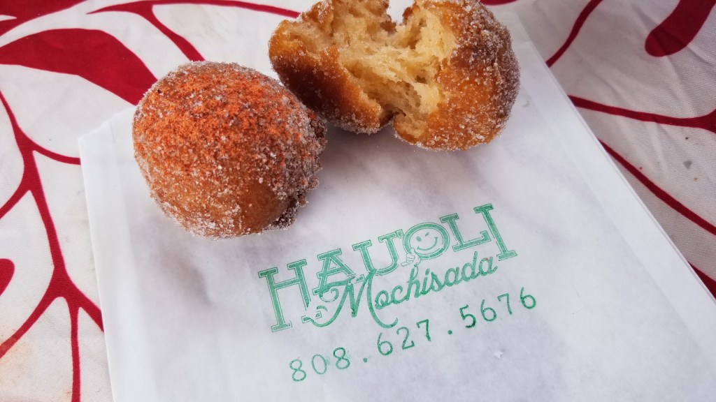
John’s ridiculously tasty chantilly mac nut brownies helped raise funds for tuition, and the idea of Hau’oli Pastry resurfaced. Soon, John was trying new recipes, most recently his “mochisada,” and it is a hit!
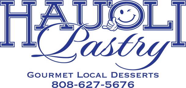
With this new iteration of John’s idea, Hau’oli Pastry, comes a renewed logo. The words hau’oli and pastry are equally prominent, and instead of black and white, the words are colored in a gradient with white and a tiffany blue. And every once in a while, you will see a happy face!
Both logos were developed in collaboration with John’s brother James who is a graphic designer, printer, and runs his own company, Royaltee Hawaii.
#hauolimeanshappy

